November 2, 2023
Styling LWC with CSS variables
Background
In Experience Cloud sites, we have to create components that give content managers ability to change color, text size, conditional display of elements and so on. To control the CSS properties of the elements, we use the technique of creating style properties in JS and assigning it to the respective element using the HTML style property as in the example below.
<h1 style={styleForHeading}>...</h1>
<p class="paragraph1" style={styleForParagraph1}>...</p>
<p class="paragraph2" style={styleForParagraph2}>...</p>
The workaround I have implemented in my design is integrating CSS variables in the root element of my component and setting one style property to that root element only. The magic of CSS variables then translates to all the child elements using those variables.
Solution
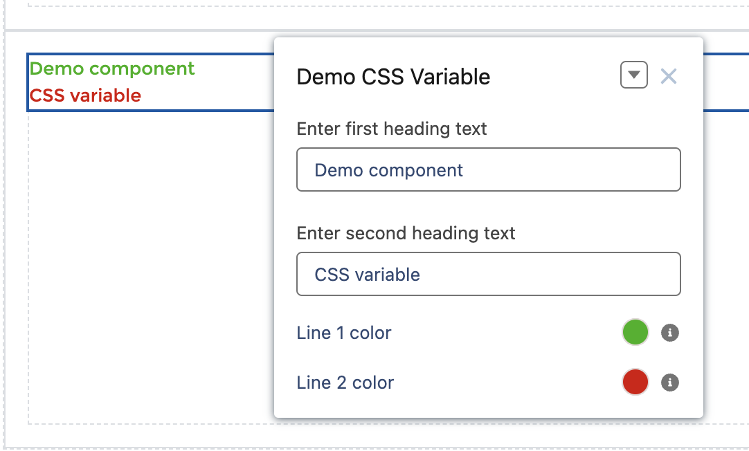
In the component below, I am setting the color of line 1 and 2 from the user choices.

The properties are set up as below in the XML configuration file.
<targetConfigs>
    <targetConfig targets="lightningCommunity__Default">

        <property
            name="heading1Text"
            type="String"
            label="Enter first heading text"
        ></property>

        <property
            name="heading2Text"
            type="String"
            label="Enter second heading text"
        ></property>

        <property
            name="heading1Color"
            type="Color"
            default="rgb(0, 0, 0)"
            label="Line 1 color"
            description="Choose a color for the first heading line"
        ></property>

        <property
            name="heading2Color"
            type="Color"
            default="rgb(0, 0, 0)"
            label="Line 2 color"
            description="Choose a color for the second heading line"
        ></property>
    </targetConfig>
</targetConfigs>
In the HTML, we have a div element with the class component-wrapper where we set the style property to {style}.
<template>
    <div class="component-wrapper" style={style}>
        <h1>
            <template lwc:if={heading1Text}>
                <span class="line-1">{heading1Text}</span>
            </template>

            <br/>

            <template lwc:if={heading2Text}>
                <span class="line-2">{heading2Text}</span>
            </template>
        </h1>
    </div>
</template>
In the CSS file, we set the CSS variables in the .component-wrapper root element with default values for colors. Each line class references the variable using var.
.component-wrapper {
    --line1-color: #000;
    --line2-color: #000;
}

.line-1 {
    color: var(--line1-color);
}

.line-2 {
    color: var(--line2-color);
}
We create a getter for style to set the CSS variables with the user-defined properties received from the component user input.
// Get properties from component
@api heading1Text;
@api heading2Text;
@api heading1Color;
@api heading2Color;

// Getters
get style() {
    return `
        --line1-color: ${this.heading1Color};
        --line2-color: ${this.heading2Color};
    `;
}
Conclusion
Using CSS variables in the root element allows to set properties that are used in multiple child elements. This eliminates the creation of separate style getters for each child element. A single style getter evaluates whenever a property changes and that property value automatically translates to the child element by the CSS variable.
Photo used in social media banner by Alexander Grey on Unsplash